⬇︎
Before

After
Design Decisions & Rationale
Structural Navigation Redesign
Real experience case study
UX Frustration as a Feature: My Real Experience While Reactivating a Website with Squarespace
As a UX designer building my portfolio site on Squarespace, I expected the process to be seamless. Instead, I found myself stuck in a confusing system of expired domains, inactive websites, unclear messaging, and missing renewal options. I’d learned in theory that good UX is about reducing friction and guiding users. But this experience made that lesson genuine.What began as a moment of personal frustration became the starting point for a deep dive into flawed user flows, ambiguous interfaces, and the critical importance of communication in design
Background / Introduction
Context
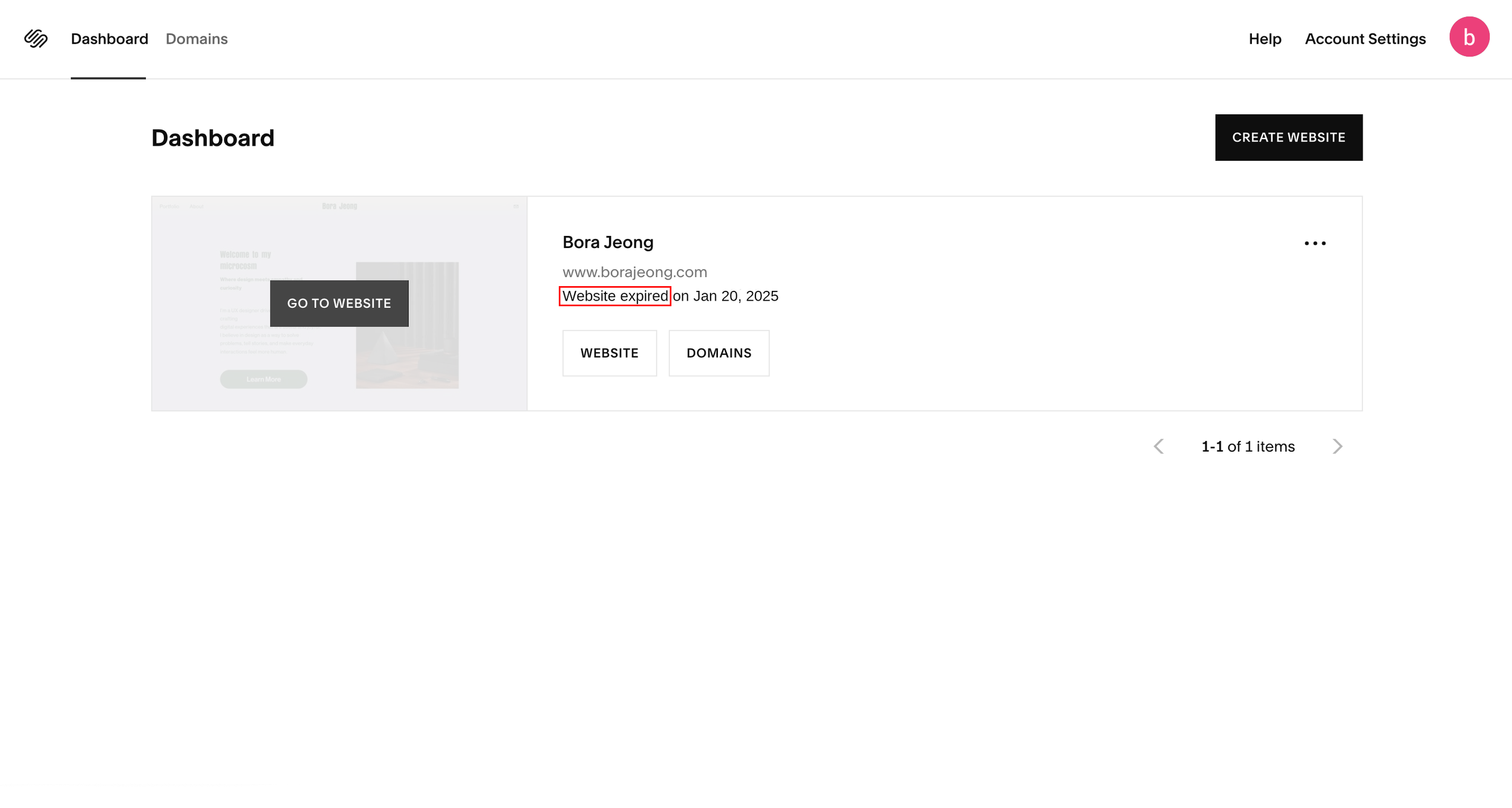
I was building my UX portfolio on Squarespace, but after pausing the project for a few months, I returned to find my subscription had lapsed. The dashboard displayed a “Website expired on Jan 20, 2025” message and two buttons: “Website” and “Domain.”. Clicking “Website” led to a page with a random placeholder URL, offering no guidance on how to proceed next. In the “Domain” section, I saw an option to reactivate my domain, which I did, assuming that would solve the issue. But it didn’t. I still couldn’t access my site, and the expiration message remained. That’s where the confusion began.
The Core Issue
The root of the issue was this: Squarespace treats domains and website plans as two separate products, but this isn’t clearly communicated.
As someone without a technical background, I assumed that renewing my domain meant my site would come back online. There was no explanation that these were managed separately, and no clear CTA or system feedback to point me in the right direction. Even clicking the “Website” button didn’t help. It led to a settings page, not a renewal option, which led me to just other guesswork and frustration.
This experience, ironically, became a real-time demonstration of the importance of user-centered design, not just visually, but also structurally. I realized how something as small as a missing label, misdirected button, or unspoken system rule could lead to real confusion, frustration, and wasted time.
The UX breakdown WHY it was confusing
As a UX designer, I couldn’t help but analyze the experience through a usability lens. What initially seemed like a simple renewal task revealed multiple breakdowns in system communication, structure, and support. Below, I highlight the key usability issues I faced, the heuristics they violate, and how they impacted my experience.
2. Confusion Between Website & Domain Plan
Problem: I assumed that renewing my domain would automatically bring my website back online. ut Squarespace manages these as two separate products, with no visible communication to explain the difference.
Heuristic Violated: 🧭 Match between the system and the real world
Interfaces should align with users’ real-world expectations and mental models.
Impact: I clicked back and forth between the “Website” and “Domain” buttons, searching for something else I was supposed to do. I didn’t realize the website required a separate reactivation step.
UX Suggestion: Use clearer language and feedback like:
“You’ve renewed your domain, but your website plan is still inactive. Reactivate your website to go live.”
1. Conflicting Status Signs
Problem: My domain was marked “active,” but the dashboard also said “Website expired.” There was no alert or banner to explain that the site wasn’t live because my website plan hadn’t been reactivated. The system gave me mixed signals with no clear cause or guidance.
As a result, I assumed the domain was still causing issues and spent hours trying to verify that externally.

Heuristic Violation: 🔍 Visibility of System Status
Users should always be informed through clear, timely, and visible system feedback.
Impact: The conflicting signals led me to believe something was still wrong with my domain — even though it had been renewed. I spent time double-checking the domain status using external tools, trying to confirm if the domain was causing the problem
UX Suggestion: Add a dashboard banner or visual status bar that clearly states:
“Domain: Active ✅ | Website Plan: Expired ❌ — Reactivate to go live
3. Lack of Clear Call-to-Action (CTA)
Problem: The dashboard showed that my website had expired, but there was no direct CTA or clear path to fix it. The “Website” button simply opened the editor with a placeholder URL, and no way to reactivate the plan.


"No clear CTA provided; the 'Website' button leads directly to the Editor page."
Heuristic Violation: 🧠 2. Recognition Over Recall
Users shouldn’t have to remember or guess what to do next. The path should be visible and contextual.
Impact: I expected the system to prompt me with a clear “Renew Website” button, but found nothing. I ended up searching settings, clicking random buttons, and reading support docs that didn’t help.
UX Suggestion: Place a visible CTA near the status message like “Reactivate Website Plan”, directly from the dashboard.
4. Broken Navigation Expectations
Problem: At first, I noticed small inconsistencies. But when I looked deeper, I discovered a widespread breakdown in navigation logic.
• “Website” and “Go to Website” both led to the same editor, despite sounding like different actions.
• The same label “Domains” existed in both the dashboard and the global header. Same destination, but via
different paths.
• “Website” opened the editor directly, while “Domains” led to a settings hub, yet both appeared parallel in
structure.
The deeper I analyzed, the more I found duplication, mislabeling, and structural inconsistency across the UI.
To visually capture the confusion, I created navigation flow diagrams that highlight the core issues. These visuals illustrate how the current structure breaks user expectations and causes unnecessary friction


Heuristic Violated: 🧭 Consistency & Standards
Interface elements that appear similar should behave consistently. Navigation should reflect a clear and logical hierarchy.
Impact:
Instead of streamlining the user journey, the navigation created cognitive friction. I clicked back and forth across dashboards, editors, and settings pages, trying to understand what each button actually did. The ambiguity made it harder to learn the system or recover from confusion.
UX Suggestions:
• Use distinct, action-based labels such as “Edit Website” and “Manage Website Plan”
• Avoid repeating the same label (like “Domains”) across different navigation paths
• Align navigational depth and hierarchy so that parallel elements (like “Website” and “Domains”) behave
similarly
5. Frustrating Support Loop
Problem: After realizing I needed to reactivate my plan, I still couldn’t find the right path. I turned to live chat support, only to receive automated responses that didn’t address my question. Even when I finally got a relevant reply, the link led to a general help article, not the action page.

▸ Updated Layout & Key Changes


Heuristic Violated: 💬 Help Users Recognize, Diagnose, and Recover from Errors
Support should offer clear, contextual guidance that reduces the user’s effort.Impact: I felt stuck and unsupported. Even with live support, I had to keep digging to solve the issue myself.
UX Suggestion:
• Make support replies more context-aware and offer direct links to the relevant action page.
• Expand support topics like “Reactivate Website Plan” to streamline help
6. Misleading and Buried Label for Website Plans
Problem: Even after realizing the real issue was renewing the website plan, I still struggled to find where to renew the site plan. The only available link was buried in the footer under the vague label “Pricing,” with no context about reactivation or subscriptions.
The redesigned dashboard improves clarity and reinforces hierarchy by updating key UI elements:
• Renamed “Go to Website” → “Edit Website”
- Renamed to better reflect the destination and reduce ambiguity about the action’s
purpose.
• Renamed “Website” → “Manage Website Plan” & “Domains” → “Manage Domains”
- Clarifies the difference between editing a site vs. managing subscriptions, making the
product model easier to understand.
• Added Website & Domain Status Messages
- Displays whether plans are active or expired, helping users understand what needs
attention, without having to dig.
• Renamed Header “Domains” → “My Domains”
- Reinforces ownership and distinguishes it from the “Manage Domains” button below,
avoiding confusion caused by duplicated labels.
• Added Tooltip Icons (❓) Next to Key Labels
- Introduced light-touch tooltips to clarify terminology without disrupting the interface.
• Updated “Create Website” Button → “+ Create Website” (Smaller Size)
- Reduced visual weight of this secondary action while still preserving visibility
While the redesigned dashboard improved the roles and visual cues of key actions, it alone couldn’t resolve the deeper usability issues. Deeper navigation flow issues still led to confusion, including duplicated landing pages, inconsistent hierarchies.
To resolve these root-level breakdowns, I restructured the underlying information architecture to better reflect user intent, maintain hierarchy consistency, and streamline the paths between intent and action.


To better align user expectations with system behavior, I redirected the “Manage Website Plan” button to the actual subscription page. This change improves clarity and prevents confusion.
This change was made for three key reasons:
1)Avoid Redundancy
Previously, this button led to the same destination as “Edit Website.” Now, each button serves a distinct purpose: content editing vs. subscription management.
2)Maintain Hierarchical Consistency
The “Manage Domains” button already directs to a settings-level page for domains. Redirecting “Manage Website Plan” to a similar level ensures consistency in hierarchy and emphasizes how these two services are managed separately but in parallel.
3)Reflect User Intent More Accurately
When users click “Manage Website Plan”, they are likely looking to view or change their subscription. The updated destination meets this expectation, leading users to find relevant controls directly and reducing friction.
At first, I considered redirecting this button to the domain overview or renewal page, especially to mirror the “Manage Website Plan” flow more closely. But after closer analysis, I concluded that the current flow still works best for the following reasons:
1) It acts as a central hub.
Users can access owned domains, renewals (via "Add Year"), or purchase new domains all from this one page.
2) It supports broader user needs.
Unlike website subscriptions, domain actions branch in more directions. This page allows for flexible next steps.
3) It avoids premature deep-linking.
Sending users directly into a specific domain’s settings or a purchase screen would assume too much about their intent.
📌 To reduce potential confusion, I added contextual tooltips near both “Manage Website Plan” and “Manage Domains” to clarify their roles—helping users navigate with confidence without altering familiar flows.
Relocated “Pricing” to Primary Navigation


What Changed
Renamed the top-level “Pricing” label to “Plans & Pricing”
Moved it to the main navigation bar for higher visibility
Why
The original label (“Pricing”) was easily overlooked and didn’t clearly signal where to manage or explore plan options. By renaming it to “Plans & Pricing,” the purpose becomes immediately clear, even to first-time users. Placing it in the top-level navigation emphasizes its importance, increases discoverability, and builds trust by surfacing subscription details early
Chatbot Support Improvements
What Changed
Improve its ability to recognize rephrased or varied user inputs.
Provide more detailed support topics to streamline the help
Offer direct links to actionable pages rather than general articles.
Provide the option to escalate to a real person after a few failed attempts.
Why
The current chatbot often defaults to generic responses that leave users stuck or more confused than before. Even when links are provided, they frequently point to passive articles rather than tools for solving the problem.
These enhancements focus on making chatbot support:
More relevant (by understanding what users actually mean)
More actionable (by connecting users to settings or workflows)
More human (by offering real help when automation fails)
This creates a support experience that feels intelligent, responsive, and user-centered, especially critical during moments of frustration.
What I Discovered Beyond the Initial Scope
While the main focus of my redesign centered on clarifying dashboard interactions and improving navigation flows around websites and domains, the process of deeper exploration revealed several additional areas where users could feel confused or lost.
These weren’t part of the original redesign scope, but they are connected directly to the broader UX goal of making the platform easier to understand and manage. Rather than overlook them, I chose to address a few of these pain points with small, targeted fixes that help improve the overall experience.
Ambiguous Terminology: The combined “Domains & Email” label under Settings was unclear and lacked explanation. Without any context, it was confusing why domains and email were grouped together, what the email section was for, and why users might need it.
Badge Confusion: ”Primary,” “Active,” and “Never Expires” are used across domain pages without consistent visual or functional logic, causing uncertainty about domain status and priority.
Scattered Billing Information: Billing and subscription details were buried in multiple places without clear labels, making it difficult to find and understand website plan costs versus domain renewals.
🔧 Recommendations for Future Improvements
Separate “Domains” and “Email” Settings
Split the combined section into distinct pages like “Domains” and “Business Email” to improve clarity.Clarify Badge Terminology
Standardize language and use consistent color schemes for domain labels so users can quickly understand what’s primary, active, or expiring.Improve Billing Menu Labels
Rename ambiguous headers like “Billing” to “Website Billing” and “Domain Billing” to help users find the right section faster.Embed Tooltips and Microcopy
Offer short, context-sensitive explanations (e.g., “What is a domain?”) throughout the settings flow to reduce user anxiety and confusion, especially for non-technical users.
💬 Reflection
I used to think that “user-friendly” simply meant clean and minimal. But through this redesign, I realized it’s about something deeper, such as clarity, intuition, and emotional support at just the right moment.
What started as a straightforward cleanup of dashboard labels and buttons led me to uncover structural inconsistencies, vague terminology, and overlooked friction points. And in trying to fix those, I experienced first-hand the frustration users likely feel, confusion, dead ends, and doubt about where to go or what to do next.
That experience became one of my most valuable design lessons. I won’t forget how it felt, and I’ll use that awareness to create experiences that are not only functional but genuinely supportive and trustworthy.
Updated Navigation Flows & Rationale
✅ “Manage Website Plan”
→ Now Leads to: Settings > Billing > Subscriptions > Website
✅ “Manage Domains”
→ Remains: Settings > Domains & Email > Domains
System-Level Enhancements
Overview: What Changed & Why
While the primary redesign efforts focused on the dashboard and navigation structure, I also introduced a set of system-level improvements aimed at refining the overall experience. These changes enhance clarity, reduce friction across the platform, and support users at key decision points. Though smaller in scope, these refinements play a critical role in elevating the platform’s usability and aligning it with users’ mental models.
Decisions and reasoning
This screen recordings show how hidden and unintuitive the website plan renewal link (‘Pricing’) is within the interface.
Heuristic Violated: 📍 Recognition Over Recall
Important actions should be visible, predictable, and clearly labeled.Impact:
Because the "Pricing" link was located at the very bottom of the main page, I didn’t even realize it existed at first. I kept searching through settings and help articles, feeling lost. Even when I finally found it, “Pricing” didn’t feel like the right place to manage an expired plan, making me question whether that’s the right link.
UX Suggestion:
• Place this CTA in a more visible, top-level location to make it easier to access and also surface it
prominently in the dashboard or settings.• Use clearer, action-based labels like “Renew Website Plan” or “Manage Subscription”.
Redesign suggestions
✨ Overview: What Changed & Why
To address the core UX problems identified, I implemented the following key changes:
Clearer Labels & Status Indicators
→ Renamed ambiguous buttons and introduced prominent website/domain status messaging to help users
quickly understand account states.Contextual CTAs
→ Added clearer CTAs like “Manage Website Plan” to guide users toward important actions in the right context.Improved Navigation & Hierarchy
→ Reorganized the flows so that buttons lead to consistent, predictable destinations with matching hierarchy.Helpful Tooltips
→Included helpful tooltips near unclear terms (e.g., “Primary domain”) to support user understanding without
interrupting flow.
Redesigned Dashboard
I began with quick wins—refining key buttons, labels, and UI elements on the dashboard to clarify each action’s intent and reduce user confusion. These surface-level improvements were designed to guide users toward the right next step without hesitation. The primary goal was to make the separation between website plans and domain subscriptions immediately clear, helping users quickly understand what’s active, what requires attention, and where to go—all at a glance

After identifying multiple breakdowns in the original navigation and communication flow, ranging from ambiguous labels to inconsistent hierarchies, I focused on simplifying the experience while reinforcing structural clarity.
The redesign addresses core usability issues by:
Clarifying the separation between website and domain plans
Improving labeling and visual hierarchy to better align with user expectations
Introducing consistent navigation flows with clearer actions and contextual support
The following solutions combine quick wins and structural improvements, designed to deliver immediate clarity while enhancing the overall usability of the dashboard.