⬇︎
Before

After
Design Decisions & Rationale
Structural Navigation Redesign
Real experience case study
UX Opportunity for improvement:
My Real Experience While Reactivating a Website on Squarespace
While reactivating my UX portfolio site on Squarespace, I ran into a confusing mix of expired domains, hidden renewal options, and unclear messaging. What began as personal frustration became a hands-on UX lesson in user-centered design, system feedback, and intuitive navigation as a UX Designer.
💻 Background
Context
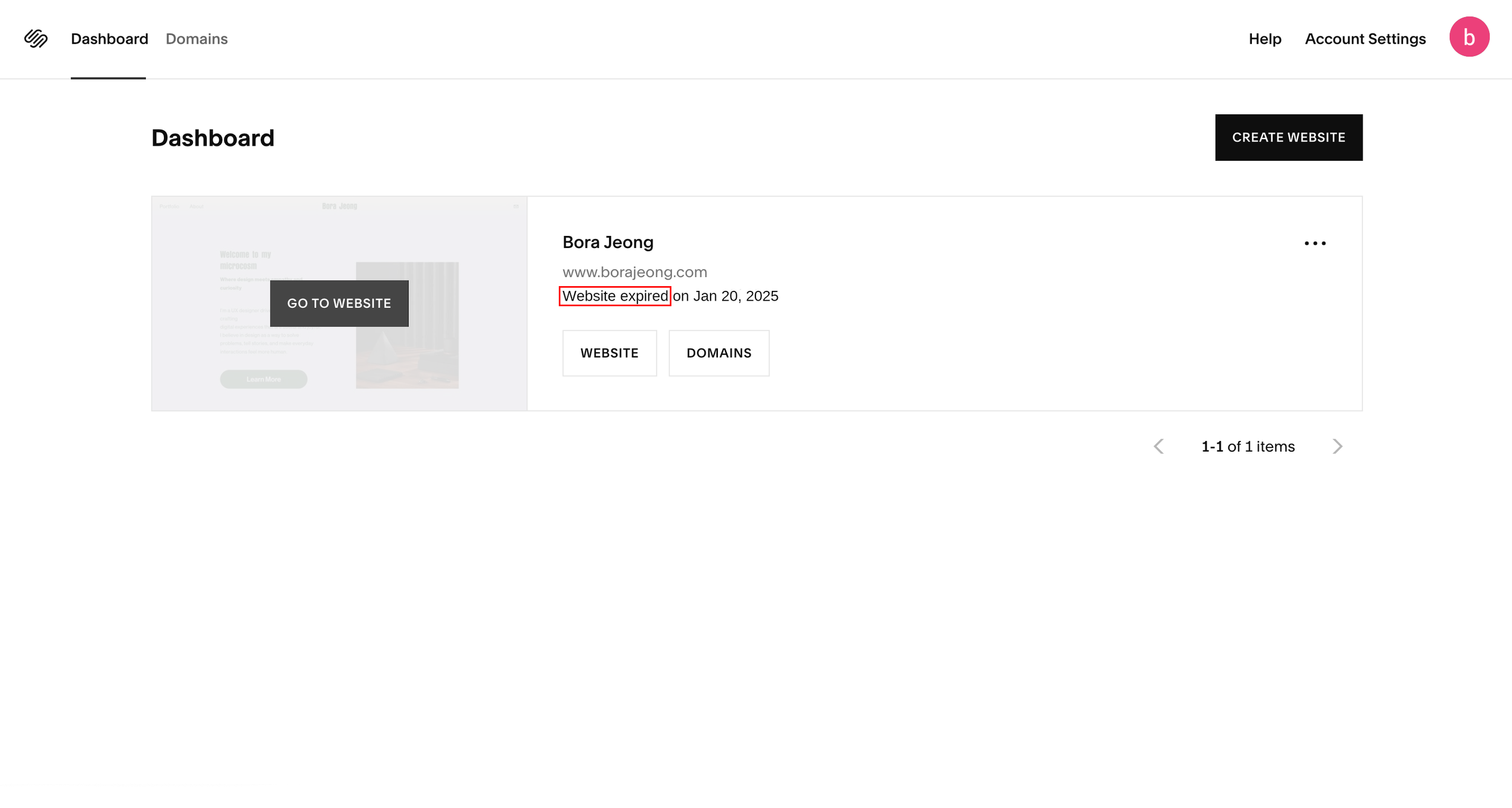
• I logged in to reactivate my portfolio site.
• The dashboard showed: “Website expired on Jan 20, 2025.
• Two main actions were visible: Website and Domain
• Clicking “Website” led to a placeholder URL; “Domain” allowed me to reactivate the domain, but the site still didn’t
come online.
The Core Issue
Squarespace treats domains and website plans as separate products, but the dashboard doesn’t communicate this distinction clearly. As a user, I assumed renewing the domain would reactivate the website. Instead, unclear labels, inconsistent navigation, and hidden plan information led to unnecessary confusion.
Why This Matters
This ambiguity disrupts a critical revenue moment (renewal) and increases support load — while also creating a deeply frustrating user experience.
🧱 The UX breakdown WHY it was confusing
As a UX designer, I couldn’t help but analyze the experience through a usability lens. What initially seemed like a simple renewal task revealed multiple breakdowns in system communication, structure, and support. Below, I highlight the key usability issues I faced, the heuristics they violate, and how they impacted my experience.
2. Confusion Between Website & Domain Plan
Problem: No communication that these are separate products.
Heuristic Violated: 🧭 Match between the system and the real world
Interfaces should align with users’ real-world expectations and mental models.
Impact: Assumed domain renewal = website renewal.
Clicked back and forth between “Website” and “Domain” without understanding needed actions.
1. Conflicting System Status Messages
Problem: Domain marked “active,” but dashboard said “Website expired.”
Heuristic Violation: 🔍 Visibility of System Status
Users should always be informed through clear, timely, and visible system feedback.
Impact: Spent hours verifying externally, unsure what was wrong

3. No Clear Call-to-Action for Website Renewal
Problem: “Website” button opens the editor, and no direct CTA to reactivate the website plan.
Heuristic Violation: 🧠 2. Recognition Over Recall
Users shouldn’t have to remember or guess what to do next. The path should be visible and contextual.
Impact: Searched settings and support docs, which wasted time.


"No clear CTA provided; the 'Website' button leads directly to the Editor page."
4. Inconsistent Navigation & Broken Hierarchy
Problem: As I analyzed the dashboard more deeply, I found multiple mismatches between labels, destinations, and hierarchy.
• “Website” and “Go to Website”, both led to the same editor
• “Domains” appeared twice in two different navigation area
• “Website” opened the editor directly, while “Domains” led to a settings hub, yet both appeared parallel in
structure
To visually capture the confusion, I created navigation flow diagrams that highlight the core issues. These visuals illustrate how the current structure breaks user expectations and causes unnecessary friction.


Heuristic Violated: 🧭 Consistency & Standards
Interface elements that appear similar should behave consistently. Navigation should reflect a clear and logical hierarchy.
Impact: Cognitive friction, confusion over hierarchy.
5. Support Loop That Didn’t Help
Problem: Chat support returned generic or irrelevant responses.
Heuristic Violated: 💬 Help Users Recognize, Diagnose, and Recover from Errors
Support should offer clear, contextual guidance that reduces the user’s effort.Impact: Effortful and confusing support experience.


6. Critical Renewal Link Hidden Under “Pricing” in Foote
Problem: Renewal link buried under vague “Pricing” label in footer.
Heuristic Violated: 📍 Recognition Over Recall
Important actions should be visible, predictable, and clearly labeled.Impact: struggled to find the critical action, which led to frustration.
The redesigned dashboard improves clarity and reinforces hierarchy by updating key UI elements:
• Renamed “Go to Website” → “Edit Website”
- Clearly reflects destination; reduces ambiguity.
• Renamed “Website” → “Manage Website Plan” & “Domains” → “Manage Domains”
- Clarifies the difference between editing a site vs. managing subscriptions, making the
product model is easier to understand.
• Added Website & Domain Status Messages
- Displays whether plans are active or expired, helping users understand what needs
attention, without having to dig.
• Renamed Header “Domains” → “My Domains”
- Reinforces ownership and distinguishes it from the “Manage Domains” button below,
reducing confusion with it.
• Added Tooltip Icons (❓) Next to Key Labels
- Clarifies terms without cluttering UI.
• Updated “Create Website” Button → “+ Create Website” (Smaller Size)
- Secondary action, so make it visible but reduced visual weight.
The dashboard improvements clarified key actions, but deeper navigation issues remained: duplicated pages, inconsistent hierarchies, and unclear paths. To resolve these, I restructured the underlying information architecture to better align with user intent, maintain consistency, and streamline navigation.


This button now leads directly to the subscription page, aligning with user expectations.
Avoid redundancy: Separates content editing from subscription management.
Maintain hierarchy consistency: Aligns with the “Manage Domains” path's hierarchy, making navigation feel logical and expected.
Reflect user intent: Users looking to manage subscriptions reach the relevant page directly.
At first, I considered redirecting this button to the domain overview or renewal page, to parallel the “Manage Website Plan” flow exactly. But I concluded that the current flow still works best for the following reasons.
Central hub: Users can manage all domain-related actions in one place.
Supports flexible needs: Users need flexible access to multiple domain-related actions
Familiarity: It maintains the structure that Squarespace users already know
📌 To support clarity, I added contextual tooltips explaining the difference between plan management and content editing.g familiar flows.
Relocated “Pricing” to Primary Navigation

⬇︎

Moved it to the main navigation bar for higher visibility
By placing it in the top-level navigation, it emphasizes its importance, increases discoverability, and builds trust by surfacing subscription details early
Chatbot Support Improvements
Improve its ability to recognize rephrased or varied user inputs.
Provide more detailed support topics to streamline the help
Offer direct links to actionable pages rather than general articles.
Provide the option to escalate to a real person after a few failed attempts.
By improving generic, manual responses, leaving users frustrated, the chatbot becomes more responsive, actionable, and human, making the overall support experience better and reliable.
💬 Reflection
I learned that user-friendly is not just clean visuals; it’s clarity, predictability, and emotional support. This project showed me how minor structural issues, ambiguous labels, hidden links, and redundant navigation create real frustration.
By personally experiencing this as a user and redesigning it, I internalized what the User-friendly design truly means, guiding users efficiently, reducing cognitive load, and making intentions clear at every step.
Updated Navigation Flows & Rationale
✅ “Manage Website Plan”
Now Leads to -> Settings > Billing > Subscriptions > Website
✅ “Manage Domains”
→ Remains: Settings > Domains & Email > Domains
System-Level Enhancements
In addition to the dashboard and navigation redesign, I made some system-level improvements to refine the user experience. These updates enhance clarity, reduce friction, and guide users better. While smaller in scope, they boost usability and align the platform with user expectations.
This screen recordings show how hidden and unintuitive the website plan renewal link (‘Pricing’) is within the interface.
✍️ Redesign suggestions
Redesigned Dashboard

Clarify the separation of website vs domain plans
Improve labeling & hierarchy
Streamline navigation & reduce friction
Provide contextual support
Goal