Pit a Pet
UX Design | Google Certificate Project | Figma | April 2023
Pit a Pet is a mobile app designed to support pet owners with everyday care, from health tracking and training guidance to finding reliable services and capturing memories. As pet ownership continues to rise, this app's goal was to explore how thoughtful UX can reduce daily stressors and strengthen the bond between human and pet.
🧱 Laying the Foundation
Project Background & Problems
Pet ownership in the U.S. has grown significantly over the past three decades. As of 2023, 66% of U.S. households (86.9 million homes) own a pet. Many consider them family, yet ownership brings real challenges: from daily messes and vet expenses to training and travel logistics.
According to a 2023 study by Forbes Advisor:
54% of dog owners report having some regrets about getting a dog
Common stressors include cleaning (27%), care logistics (26%), and cost (24%)
These pain points revealed a real opportunity to design an app that could make everyday pet care feel more manageable and supportive.
Concept Overview
To address these real-world challenges, the concept of Pit a Pet was created as a supportive tool that helps pet owners manage their pets’ health, daily routines, and special memories all in one place.
The app brings essential information, actions, and emotional touchpoints into a single, user-friendly system.
Project Objectives
Help pet owners manage health routines and wellness records with ease
Reduce stress by simplifying day-to-day care tasks
Provide a space to celebrate memories and milestones with their pets
Build emotional connection through a personalized and intuitive design
💭 Defining the Core Experience
A name and tagline of an app
App Name: Pit a Pet (Pit a pat + A pet)
The name communicates warmth and emphasizes the bond between owners and their pets.Tagline: “Pets make your life better.”
A simple reminder that pets bring not just joy, but deep companionship and emotional value.
Core Features
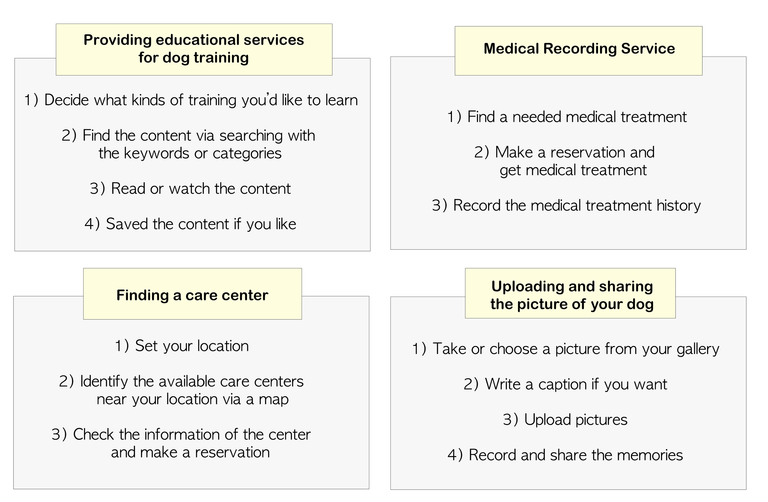
🐶 Dog Training Education
Offer guided articles, videos, and tips to help owners learn training techniques at their own pace.💊 Medical Records Management
Log vet visits, vaccinations, medications, and track overall health easily.📍 Care Center Finder
Location-based recommendations for daycare, boarding, grooming, and veterinary services.📸 Memory & Moment Recording
A dedicated space to save photos, track milestones, and revisit shared experiences.
Defining app’s function step by step
Main target user
Millennial and GenX Pet(Dogs) owners who are concerned about their pet’s well-being but struggle with a lack of knowledge on how to raise their pets.
🧩 Structuring the Product
Sitemap

Wireframe
Early wireframes focused on clarity and a predictable layout, ensuring users could quickly interpret available actions from the first interaction.

Low-fidelity Prototype

🎨 Visualizing the Solution
Key Mockups
The visual direction emphasizes warmth, closeness, and clarity through soft color palettes, card-based layouts, and friendly typography.
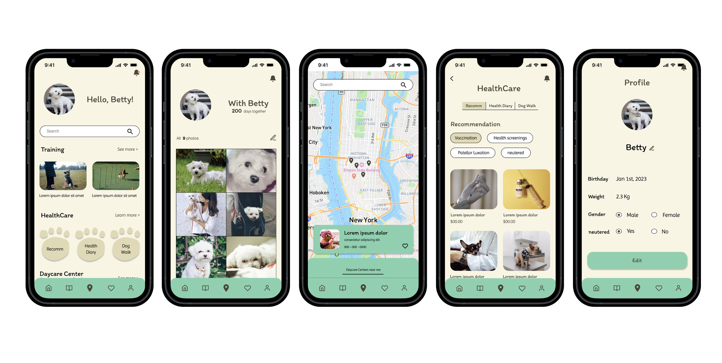
Feature Flows
After crafting the visual direction of the app through key mockups, I shifted focus to translating each core feature into a clear, user-friendly flow.
This is how the app’s main functions are implemented across screens, tying together design and functionality to create a cohesive user experience.


High-Fidelity Prototype
This prototype showcases the visual style, structure, and user flow, aiming to create a seamless and intuitive experience from start to finish.

🧠 Reflection & Takeaways
Even though this was a simplified, concept-focused project, I ended up doing more refining and problem-solving than I initially expected, which turned out to be a great thing. As I worked through the app’s features, I often rethought how things were structured or added new screens or elements to improve clarity and usability.
While I didn’t conduct formal user testing, I made it a point to reflect as I went, identifying missing elements and revising screens to make the experience clearer and more cohesive. That ongoing adjustment became an important part of the process, understanding the necessity of continuous revising based on the reflection to improve usability.
If this were a real product, the next step would be usability testing to validate the design and uncover insights from real users, something I’d look forward to if I were involved in the real project.